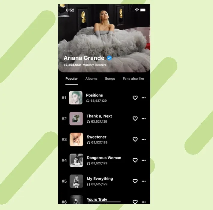
I wanted to do something a little more complete for this third design. You can find here the result:
As you can see, you can create beautiful interfaces with Flutter, and the most exciting part is that it didn't require a lot of "hacks" to get to this result.
To display your favorite Ariane Grande albums, with a combination of a stretchy and a sticky header, here is what you have to do.
You can find the complete code at the end of the article.
Get the stretch effect.
To get the stretch effect to work on the header properly, you must use several things together.
First, you'll need to use a SliverAppBar with a FlexibleSpace. By default the FlexibleSpace has this stretch mode:
stretchModes = const [StretchMode.zoomBackground]
It was perfect for the effect I wanted, but you can change it for something fancier. Secondly, to keep the stretch effect, you couldn't use a NestedScrollView; otherwise, the body of the NestedScrollView wouldn't make the header overscroll.
I decided to keep a SliverList in a CustomScrollView to keep the overscroll effect.
Make the second header stick.
Making the second header stick was a little bit harder. I wanted to use a second SliverAppBar pinned, but there were two bugs.
The first one is that the stretched SliverAppBar would go over the second SliverAppBar. To solve that, I just added an empty SliverToBoxAdapter before my SliverAppBar:
SliverAppBar(
  expandedHeight: expandedHeight,
  collapsedHeight: 90,
  stretch: true,
  backgroundColor: Colors.black,
  foregroundColor: Colors.transparent,
  flexibleSpace: ClipRRect(
    borderRadius: const BorderRadius.only(
      bottomLeft: Radius.circular(24),
      bottomRight: Radius.circular(24),
    ),
    child: FlexibleSpaceBar(
      collapseMode: CollapseMode.parallax,
      background: Image.network(
        coverImage,
        fit: BoxFit.cover,
      ),
      expandedTitleScale: 1,
      titlePadding: const EdgeInsets.all(24),
      title: const Title(),
    ),
  ),
),
// Used to get the stretch effect to not be above the SliverAppBar
const SliverToBoxAdapter(),
SliverAppBar(
  backgroundColor: Colors.black,
  toolbarHeight: _offset + kToolbarHeight,
  title: Column(
    children: [
      SizedBox(height: _offset),
      const ChoiceTab(),
    ],
  ),
  primary: false,
  pinned: true,
),
Note that you cannot use a SafeArea in this part, otherwise, your picture wouldn't go behind the status bar:


The second one was a little bit trickier. Since I'm not using a SafeArea, my pinned SliverAppBar will get into the status bar when you scroll to the top.
I needed to add some offset to the toolbar height and the column to move the SliverAppBar out of the status bar in the above code.
To calculate the offset, I just added a small function listening to the ScrollController:
setState(() {
  _offset = min(max(0, _controller.offset / 6 - 16), 32);
});
This function is a lot of trials but it gives a nice effect to the second header.
Conclusion
And that's it! You now have a fancy design for your album page. If you want to check out the complete code, check it on my GitHub.
Don't forget to follow me on Twitter for more UI tips or to subscribe to get all my new posts directly!


